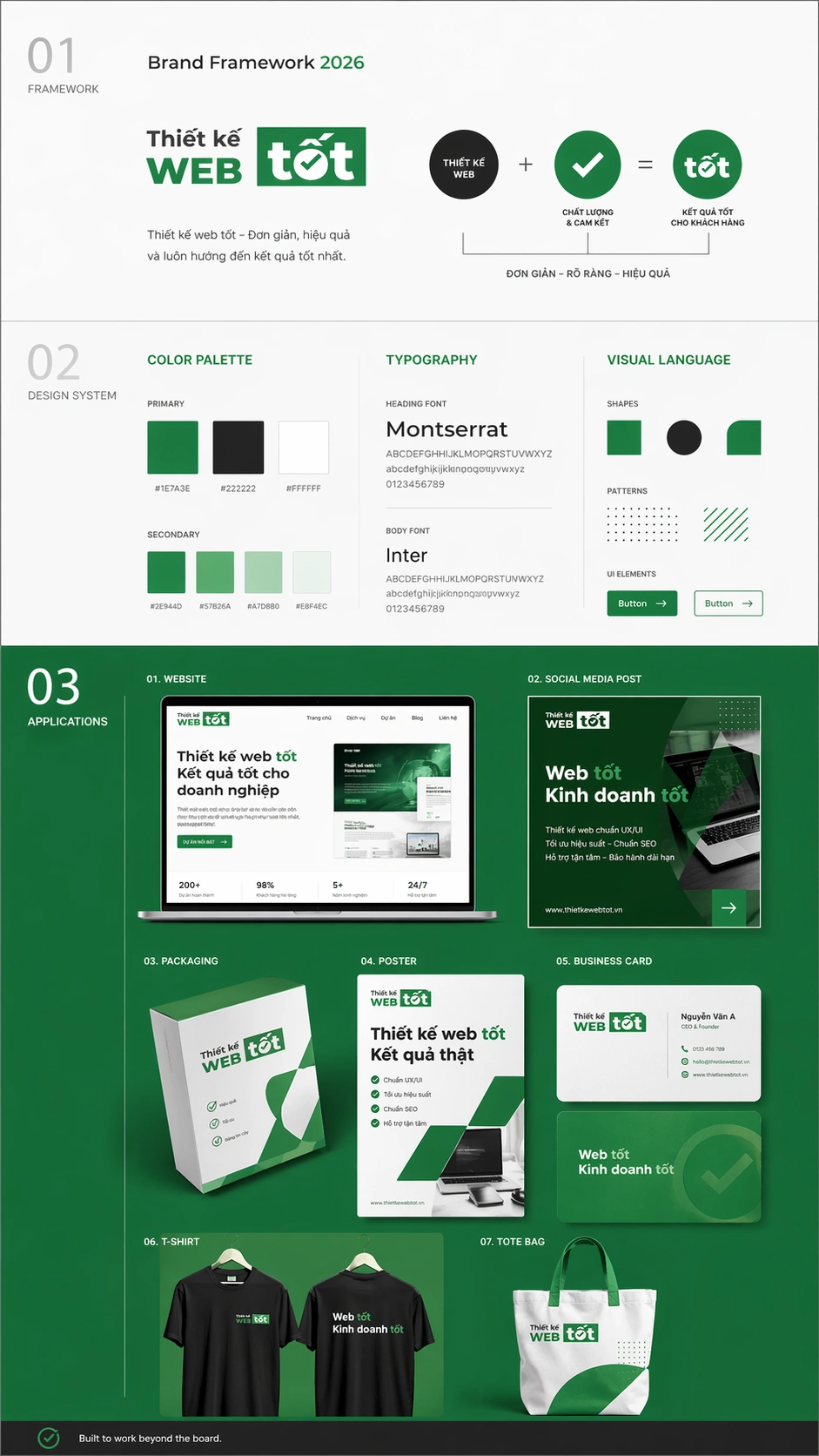
Nếu bạn đang cần một bộ nhận diện thương hiệu gọn gàng, dễ triển khai, đây là prompt đáng dùng. Cấu trúc chia 3 phần rõ ràng: Framework → Design System → Applications, giúp thể hiện từ ý tưởng đến ứng dụng thực tế trên web, social, ấn phẩm.
Prompt này tập trung vào hệ thống, không lạm dụng logo. Màu sắc lấy trực tiếp từ logo, typography rõ ràng, layout nhất quán. Phần ứng dụng hiển thị mockup thực tế như website, bài đăng, poster, name card… nên dễ hình dung và dùng ngay.
Phù hợp cho:
- Người làm web cần trình bày brand cho khách
- Designer muốn build guideline nhanh
- Agency cần demo concept chuyên nghiệp
Cách sử dụng
Truy cập chatgpt, tải ảnh logo lên và dán promt sau
Please reference my logo images i attached and create Brand Framework - 9:16 Board
Core Concept: Create an ultra-clean, 2D editorial vertical presentation board (9:16). Focus on Brand System logic: Reference > System > Application.
1. STRUCTURE & HIERARCHY (Strict 18/32/50)
Divide vertically with increasing visual weight from top to bottom:
• TOP (18%): Framework. Airy, minimal. Includes "Brand Framework 2026", origin logo, 1 sentence essence, and visual logic diagram.
• MIDDLE (32%): Design System. Structured grid. Showcase color palette (derived from logo), typography pairing, and visual language (shapes/patterns).
• BOTTOM (50%): Applications. High density. 6-7 realistic mockups (Web, Social, Packaging, Poster, Merch) using the brand's layout system—not just logo placement.
2. SYSTEM RULES
• Logo Usage: High accuracy, low frequency. No decorative repetition or "wallpaper" effects. Use functional placeholders if accuracy is compromised.
• Consistency: Driven by color logic, spacing, and typography hierarchy, not by repeating the logo.
• Color: Strictly derived from the uploaded reference (allow tonal expansion/neutrals).
• Visual Language: Adaptive. If the logo is graphic, show linework/shapes. If photographic, show texture/lighting. No style mixing.
3. VISUAL ESCALATION
• Top: Low contrast, lightweight.
• Middle: Moderate detail, modular.
• Bottom: High contrast, dominant, primary color background.
• Note: Section 3 must be more visually "dense" than Sections 1 & 2 combined.
4. FINAL TOUCHES
• Avoid: Generic icons, messy collages, inconsistent mockup styles, and unrelated colors.
• Footer: "Built to work beyond the board."
• Quality: Ultra-high resolution, presentation-ready, creative director-level execution.
chúc anh em thành công